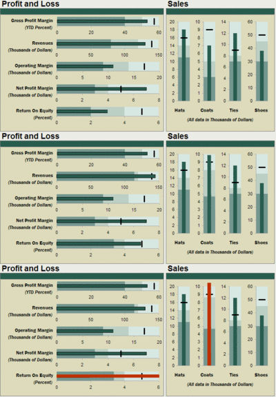
NOTE: My sample files are simulated charts created with a variety of software tools. I am not writing programs or macros for Microsoft's Excel or Apple's Numbers spreadsheets.
I found a neat product called Sparklines for Excel that provides "small, intense, simple, word-sized graphics with typographic resolution ... a sparkline can go everywhere a word or number can: embedded in a sentence, table, headline, map, spreadsheet or graphic".
Here's a complex table with numerical data plus some pie, line and bar sparklines. No animation on this one, sorry. [click on the chart to enlarge]
While perusing the Sparkline blog I also learned about BeGraphic, a Paris-based company that produces graphical tools to animate and illuminate data. Sometimes movement catches your eye and enlightens you! Here's an example of a 6-Forces Graph, showing how a company is pulled in various directions by changes in its environment over three years:
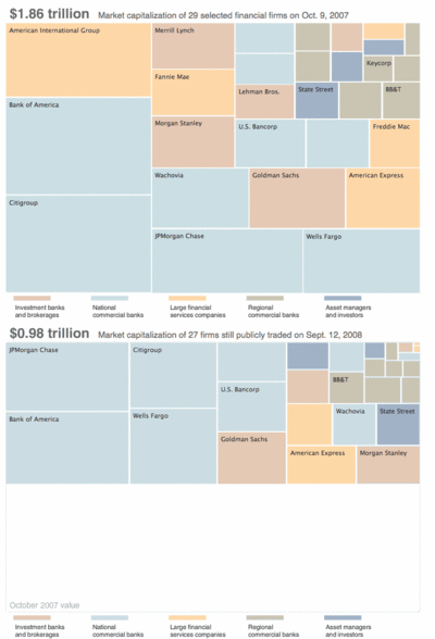
Eventually I stumbled onto Squarified Tree Maps. You can learn more here. The graphic below is an example of a squarified map - I animated two graphs created originally by the NY Times. The size of the blocks, their position and their color contain the information about companies in the financial services business - before and after 2007's stock market crash.
If you would like to monkey around with some data and charts, you can go over to GAPMINDER, load the World Tool, and use their global statistics to play chart-maker. I made these bubble charts to track changes in 8th grade math scores by country and per-capital income, over a period of 12 years.
Lest you think charts are the answer to everything, wander over to Junk Charts, a highly-entertaining analysis of very bad info-graphical charts.


No comments:
Post a Comment
Type your comment here