Actually the printer's name is not Peter, it's Dewey or Chris.
Dewey prints our Excel Math Lesson Sheets. Chris prints the Teacher Editions. John coil-binds them. Mike and Grant and lots of FedEx folks deliver these products to schools.
Sometimes people wonder why we still use paper. After all, they say, everything else is on computer nowadays.
Well, there are lots of reasons. One is that we (human-type-units) are more than just brains, and math is more than just numbers.
As I have said before, math is a special language. A language of counting, measurement, shapes and calculation. A language with precise definitions and specialized terms.
Math demands action. Movement. Investigation. Measuring. Reasoning. Rearrangement. Trials. Conclusions. Reassessment. Erasing. Rewriting.
We think it's important to write. Line up those unruly numbers. Carry those tens over, get the places straight. Look at a number to know if it's in the ballpark. Make a tally. Count on your fingers. Sketch a shape.
Kids (all of us?) need to deal with these tangible parts of mathematics.
Some ask, Why don't you charge a reasonable fee for the development (intellectual property) and just send some pdf files? Let the schools print their own.
Why not? I'll show you why not. Let's do some math.
For one student for one year, we need 370 page images (185 sheets) of legal size paper, both sides, including tests.
I checked some current pricing online, and find printing at about 10-11¢ per sheet in quantities of 100 to 10,000 pages.
That's on white paper; b/w images on both sides, not including tax, delivery, collating and packaging. But for the comparison, let's ignore those extra costs.
Let's pick a round number - say $5 per student per year for the intellectual property.
Assume we have a nice big printer in the school, it never runs out of toner or ink, it's conveniently located near the classrooms, and the teachers can organize their personal printing schedules ...
But I need these before my class!
Sorry we're busy now, come back later.
Okay, so now we just multiply:
11¢ per sheet x 185 lessons = $20.35 per student
That's for the printing alone. Now add $5 for our research and development work. That's reasonable isn't it? Only $25.35 per year per student?
We sell Excel Math for $10.00 per student, including development and updates.
How can we do it? Are we crazy?
The magic is in the numbers ... and the efficiency of a printing press. We start it up and don't shut it off until the building is full of Lesson Sheets.
Not only is a printing press much cheaper than doing it yourself, it keeps Dewey, Chris, John, Mike, Grant and the rest of us off the street!
As Bob, our VP of Sales likes to say, Buy Excel Math. My son James needs new shoes.
Wednesday, September 30, 2009
Tuesday, September 29, 2009
Scoville and the Piquant Paprika
I had dinner in a Greek restaurant the other night with a large group of people.
Amy, sitting on my right, ordered a beef dish. The menu description was Piquant beef sirloin tips and onions spiced with twelve seasonings. That started a discussion of the word piquant and what it might mean.
Did piquant mean smelly, like Phil's BBQ? Did it mean hot, like chili powder? Was it spicy in some mysterious Greek way? Could it be ordered like Thai food, in degrees of piquancy? Can you make mine a 6 out of 10, please?
We needed some facts. Here's where I started.
I started a search for piquant things on the internet. Most were food-related. Here a sauce, there a market, everywhere a piquant. I turned to recipes. Piquant was usually associated with a sauce. It was eaten with meat, or occasionally vegetables. Often the recipes had a Cajun theme, with alligator or frog's legs.
I looked for common ingredients and found: Bell Peppers, Cayenne Pepper. Green peppers. Jalapeno peppers. Papriki (dried, ground peppers). Occasionally I saw Mustard, or Wasabi.
Aha! The common thread in piquant is a little zing added by some form of peppers or mustard. This photo pretty much sums it up. As does this recipe from the same source.
Peppers and Penzeys’ Paprika Produce Piquant Paprikash
Now that I felt comfortable with the origins and production of piquant food, I realized I another problem.
How would I get a math theme out of this?
Let's go back to the piquancy. How do you specify spiciness in your supper?
One approach is the Scoville Scale of Spiciness, which we discuss in 6th grade Excel Math.
About 100 years ago, scientist Wilbur Scoville developed a temperature scale to measure the heat of chili peppers. He knew spiciness is created by a chemical called Capsaicin, found in plants of the Capsicum family. He knew a tongue was more sensitive than any available machine.
Scoville soaked his peppers in alcohol, which extracted the "heat" components. This liquid pepper extract was diluted in sugar water until the sting could just be detected by a panel of tasters. This is similar to how we measure the concentration of odors.
The dilution factor becomes the basis of a Scoville rating. Sweet peppers are 0 units. Mild poblano and Anaheim chilis are around 1,000 Scoville units. The hottest habanero chilis are rated 200,000 - 500,000!
Granted, this isn't the easiest way to measure seasonings, since we shouldn't subject our sweethearts to sipping spicy sugar syrup.
An alternative method is to use liquid chromatology to measure the heat-producing chemicals in your pepper, and rate them in American Spice Trade Association (ASTA) pungency units.
More realistically, we just season by a pinch or a pour 'til it's piquant!
Amy, sitting on my right, ordered a beef dish. The menu description was Piquant beef sirloin tips and onions spiced with twelve seasonings. That started a discussion of the word piquant and what it might mean.
Did piquant mean smelly, like Phil's BBQ? Did it mean hot, like chili powder? Was it spicy in some mysterious Greek way? Could it be ordered like Thai food, in degrees of piquancy? Can you make mine a 6 out of 10, please?
We needed some facts. Here's where I started.
- Definition: Piquant is agreeably stimulating to the palate, pleasantly pungent, spicy, tart. Affecting the organs of taste or smell with a strong and possibly harsh sensation
- Pronunciation: pay-khan
- Origin: from the French, 1630
- Colors: red-orange
I started a search for piquant things on the internet. Most were food-related. Here a sauce, there a market, everywhere a piquant. I turned to recipes. Piquant was usually associated with a sauce. It was eaten with meat, or occasionally vegetables. Often the recipes had a Cajun theme, with alligator or frog's legs.
I looked for common ingredients and found: Bell Peppers, Cayenne Pepper. Green peppers. Jalapeno peppers. Papriki (dried, ground peppers). Occasionally I saw Mustard, or Wasabi.
Aha! The common thread in piquant is a little zing added by some form of peppers or mustard. This photo pretty much sums it up. As does this recipe from the same source.
Peppers and Penzeys’ Paprika Produce Piquant Paprikash
Now that I felt comfortable with the origins and production of piquant food, I realized I another problem.
How would I get a math theme out of this?
Let's go back to the piquancy. How do you specify spiciness in your supper?
- Do you go to the same restaurant and learn by trial and ouch error?
- Do you avoid all spicy foods?
- Do you only eat your own cooking?
One approach is the Scoville Scale of Spiciness, which we discuss in 6th grade Excel Math.
About 100 years ago, scientist Wilbur Scoville developed a temperature scale to measure the heat of chili peppers. He knew spiciness is created by a chemical called Capsaicin, found in plants of the Capsicum family. He knew a tongue was more sensitive than any available machine.
Scoville soaked his peppers in alcohol, which extracted the "heat" components. This liquid pepper extract was diluted in sugar water until the sting could just be detected by a panel of tasters. This is similar to how we measure the concentration of odors.
The dilution factor becomes the basis of a Scoville rating. Sweet peppers are 0 units. Mild poblano and Anaheim chilis are around 1,000 Scoville units. The hottest habanero chilis are rated 200,000 - 500,000!
Granted, this isn't the easiest way to measure seasonings, since we shouldn't subject our sweethearts to sipping spicy sugar syrup.
An alternative method is to use liquid chromatology to measure the heat-producing chemicals in your pepper, and rate them in American Spice Trade Association (ASTA) pungency units.
More realistically, we just season by a pinch or a pour 'til it's piquant!
Monday, September 28, 2009
Come on Mr. Tally Man
Come, Mister Tally Man, tally me banana
Daylight come and me wan' go home.
Remember this Jamaican calypso number sung by Harry Belafonte?
He's talking about a specific job - taking the count of work done and recording it on a tally. We teach how to make a tally chart in 2nd grade Excel Math.
Here's a chart that shows three different totals.
In the evolution of math language, we first counted aloud, then displayed (or calculated) on our fingers, then learned to tally, or display our count in some physical format. Eventually, much later, we used written numbers.
But tallies aren't just cave-man stuff; they were used into the 1900's for certain purposes.
This illustration shows how numbers were carved in a sticks. These tallys were used to keep track of debts, and the depth and/or width of the notch could represent a debt. The deeper the notch, the deeper the debt.
How would you carve I owe you for a chicken dinner and a beer ?
A double or split stick was used to give each side a record of the debts.
As you can see here, the units of credit or debt are indicated by the depth, width and angle of the cuts in the tally sticks.
I found the term Tally Man used in a description of cowboys branding cattle. Lots of action, hooves, dust, ropes, smoke, crying calves and in the midst of it all, the tally man was keeping track of the total. You can see him walking from left to right, in the middle of the photo.
Our local newspaper carried a story this weekend about women working in tuna canneries in San Diego. Each cannery worker had a card on her back. Each time a tray of packed fish was completed, the boss (tally man) punched a hole in her card. At the end of the day it was turned in and the worker collected payment.
It looks like the woman on the left side has one of those cards on her shoulder.
Daylight come and me wan' go home.
Remember this Jamaican calypso number sung by Harry Belafonte?
He's talking about a specific job - taking the count of work done and recording it on a tally. We teach how to make a tally chart in 2nd grade Excel Math.
Here's a chart that shows three different totals.
In the evolution of math language, we first counted aloud, then displayed (or calculated) on our fingers, then learned to tally, or display our count in some physical format. Eventually, much later, we used written numbers.
But tallies aren't just cave-man stuff; they were used into the 1900's for certain purposes.
A tally has several advantages over the oral statement of a number, or the finger display of a number. Most importantly, if carved it was long-lived, so you didn't forget your count. And if done correctly, the tally could be shared, so both parties in a transaction could each have a record - thus reducing conflicts, fraud and/or creative accounting.
This illustration shows how numbers were carved in a sticks. These tallys were used to keep track of debts, and the depth and/or width of the notch could represent a debt. The deeper the notch, the deeper the debt.
How would you carve I owe you for a chicken dinner and a beer ?
A double or split stick was used to give each side a record of the debts.
As you can see here, the units of credit or debt are indicated by the depth, width and angle of the cuts in the tally sticks.
I found the term Tally Man used in a description of cowboys branding cattle. Lots of action, hooves, dust, ropes, smoke, crying calves and in the midst of it all, the tally man was keeping track of the total. You can see him walking from left to right, in the middle of the photo.
Our local newspaper carried a story this weekend about women working in tuna canneries in San Diego. Each cannery worker had a card on her back. Each time a tray of packed fish was completed, the boss (tally man) punched a hole in her card. At the end of the day it was turned in and the worker collected payment.
It looks like the woman on the left side has one of those cards on her shoulder.
Friday, September 25, 2009
The sky is falling!
And I don't mean Chicken Little (Chicken Licken, Henny Penny) or lots of baggage is falling from the sky. I mean the prices of airplanes are plummeting.
Let's see if some graphs can demonstrate what's going on.
During my publishing career I've worked with several publishers of automotive price guides in the US and UK - Edmunds' and Glass's Guide Service. We took the original sales price of the car and plotted its decline on a curve over time, showing the effects of depreciation, market opinion, and external events (gas prices, tax, etc.) We tried to predict the eventual value of the car, to help our subscribers make leases or loans.
VEHICLE DEPRECIATION
Here's a chart showing two vehicle declining in value from $30,000 to $10,000 over a 5 year period.
I made this up; they are not real vehicles. But the numbers are typical. Notice the red band shows an external factor (high gas prices) that have driven the value of one car down and the other car up.
Which one do you think has the better fuel economy? I know I gave it away using the color green but I couldn't help myself.
My friends used to say that we maliciously conspired to lower the value of their cars, causing them to lose money. Sorry. That's not how it works. We were behind the curve most of the time, trying to catch the falling prices.
There are similar information sources for aircraft values. The forecasters consider age of an aircraft (not mileage), economic conditions, and production of new aircraft as the main input. But airplanes don't wear out as quickly as cars do, nor are there very many - just a few thousand total in the world.
Notice the nearly vertical curve in the orange line, reflecting the fact that a new plane costs 7% less now than it did in January. The nearly-new plane is worth less than a brand-new one, so it drops even faster than it would have otherwise. You could lose $10 million in value in a few months ...
The monthly payment on a 60-month lease for a new 737 is now $340,000. The lease on a used one has dropped from $155,000 a month down to only $115,000 - in 8 months!
I know I can't afford a $115,000 monthly payment. But a busy airline (rare these days) or a careful and prudent business with a bit of cash can find bargains.
There seem to be about 1300 large airplanes just sitting around at the moment. In case you want to have a look or kick the tires of some soon-to-be-scrap aircraft, click here. The bottom IS falling out of them!
Let's see if some graphs can demonstrate what's going on.
During my publishing career I've worked with several publishers of automotive price guides in the US and UK - Edmunds' and Glass's Guide Service. We took the original sales price of the car and plotted its decline on a curve over time, showing the effects of depreciation, market opinion, and external events (gas prices, tax, etc.) We tried to predict the eventual value of the car, to help our subscribers make leases or loans.
Here's a chart showing two vehicle declining in value from $30,000 to $10,000 over a 5 year period.
I made this up; they are not real vehicles. But the numbers are typical. Notice the red band shows an external factor (high gas prices) that have driven the value of one car down and the other car up.
Which one do you think has the better fuel economy? I know I gave it away using the color green but I couldn't help myself.
My friends used to say that we maliciously conspired to lower the value of their cars, causing them to lose money. Sorry. That's not how it works. We were behind the curve most of the time, trying to catch the falling prices.
There are similar information sources for aircraft values. The forecasters consider age of an aircraft (not mileage), economic conditions, and production of new aircraft as the main input. But airplanes don't wear out as quickly as cars do, nor are there very many - just a few thousand total in the world.
AIRCRAFT DEPRECIATION
I saw these shocking figures in the Financial Times this morning. And we thought car depreciation was bad! Just switch the units from tens of thousands to tens of millions, and there you have it.Notice the nearly vertical curve in the orange line, reflecting the fact that a new plane costs 7% less now than it did in January. The nearly-new plane is worth less than a brand-new one, so it drops even faster than it would have otherwise. You could lose $10 million in value in a few months ...
The monthly payment on a 60-month lease for a new 737 is now $340,000. The lease on a used one has dropped from $155,000 a month down to only $115,000 - in 8 months!
I know I can't afford a $115,000 monthly payment. But a busy airline (rare these days) or a careful and prudent business with a bit of cash can find bargains.
There seem to be about 1300 large airplanes just sitting around at the moment. In case you want to have a look or kick the tires of some soon-to-be-scrap aircraft, click here. The bottom IS falling out of them!
Thursday, September 24, 2009
Which Center of the United States?
I saw a play recently at Lamb's Players Theatre, entitled Leaving Iowa. One of the scenes discussed the "Center of America", which is outside Lebanon, Kansas. But it turned out the Kansans disagreed with each other on where it should be.
Thinking math, I wondered, How did they find the center(s)?
It's not so easy to do with a country as large as ours. Here are some alternatives:
1. One story says the surveyors made a cardboard replica of the country, glued a map to one side and balanced it on a stake. The center was noted and that was it.
It appears they wanted to find the centroid, or the center of mass of a planar region - where it would balance if made of a flat material of uniform density. To do it mathematically takes serious work. Here:
2. You could find the centers of the east and west coasts, and the centers of the northern (Canadian) and southern (Mexican) borders. Draw lines between those points. That could be the center. Here we do it with straight lines.
Measuring the actual borders and finding the center point is a lot harder. Do you use low or high tide? What about rocks, inlets, bays and islands? Let's show both the coastline (no little details when measuring) and then the shoreline (every little curve and bump)
The top and bottom measure 3987 miles on the Canada border, and 1933 on the Mexican border plus we have to add 1631 miles of coastline (17,141 shoreline) for the Gulf.
The sides measure 2069 miles of coastline (28,673 shoreline) on the Atlantic and 1293 coastline (3863 shoreline) on the Pacific.
Just find the middles and connect the dots.
3. As an alternative approach, we could find each of the corner points (NE, SE, SW, NW), draw lines between the opposite corners, and make an X in the middle where the lines cross. But where exactly are the corner points? I'll spare you the details. Here I did it visually with lines. You can see there are issues with the corner point in Maine.
The problems with these two criss-cross solutions are many. First, the US is not flat, it's on a curved globe. How do we account for that? Second, what about the water? Do we go to the edge of the continental US or do we include our territorial waters? Do we "round off" any inlets or bays? Skip islands like Santa Catalina or the Florida Keys?
4. If you look for the center using your browser and Google's map, zoom in all the way and you'll be in a field near Coffeeville, KS. It's said to be an arbitrary choice. The center shown by the separate Google Maps software is in Lawrence, KS instead - allegedly because a Maps executive went to school there...
5. The geodedic center is where all the surveyors assume the center is. It was chosen in 1891. The point didn't have to be the "real" center. It's just a defined spot from which everyone starts as they survey the land. It's in Osborne, Kansas.
6. What about finding the population center, the economic center, the etc. center? If this intrigues you, check out this report from a college calculus class.
When Hawaii and Alaska attained statehood, the geographic center moved out of Kansas up to a field outside Belle Fourche, SD.
Of course, the population center moves, whenever enough of us do.
It would be safest to say the center is in the middle of the country, ok?
Thinking math, I wondered, How did they find the center(s)?
It's not so easy to do with a country as large as ours. Here are some alternatives:
WAYS TO FIND THE CENTER
1. One story says the surveyors made a cardboard replica of the country, glued a map to one side and balanced it on a stake. The center was noted and that was it.
It appears they wanted to find the centroid, or the center of mass of a planar region - where it would balance if made of a flat material of uniform density. To do it mathematically takes serious work. Here:
2. You could find the centers of the east and west coasts, and the centers of the northern (Canadian) and southern (Mexican) borders. Draw lines between those points. That could be the center. Here we do it with straight lines.
The top and bottom measure 3987 miles on the Canada border, and 1933 on the Mexican border plus we have to add 1631 miles of coastline (17,141 shoreline) for the Gulf.
The sides measure 2069 miles of coastline (28,673 shoreline) on the Atlantic and 1293 coastline (3863 shoreline) on the Pacific.
Just find the middles and connect the dots.
3. As an alternative approach, we could find each of the corner points (NE, SE, SW, NW), draw lines between the opposite corners, and make an X in the middle where the lines cross. But where exactly are the corner points? I'll spare you the details. Here I did it visually with lines. You can see there are issues with the corner point in Maine.
The problems with these two criss-cross solutions are many. First, the US is not flat, it's on a curved globe. How do we account for that? Second, what about the water? Do we go to the edge of the continental US or do we include our territorial waters? Do we "round off" any inlets or bays? Skip islands like Santa Catalina or the Florida Keys?
4. If you look for the center using your browser and Google's map, zoom in all the way and you'll be in a field near Coffeeville, KS. It's said to be an arbitrary choice. The center shown by the separate Google Maps software is in Lawrence, KS instead - allegedly because a Maps executive went to school there...
OTHER KINDS OF CENTER
5. The geodedic center is where all the surveyors assume the center is. It was chosen in 1891. The point didn't have to be the "real" center. It's just a defined spot from which everyone starts as they survey the land. It's in Osborne, Kansas.
6. What about finding the population center, the economic center, the etc. center? If this intrigues you, check out this report from a college calculus class.
A MOVING TARGET
When Hawaii and Alaska attained statehood, the geographic center moved out of Kansas up to a field outside Belle Fourche, SD.
Of course, the population center moves, whenever enough of us do.
It would be safest to say the center is in the middle of the country, ok?
Wednesday, September 23, 2009
Daylight "saving" time?
Most of the US observes Daylight Saving Time (DST). Unless you live in part of Arizona, or all of Hawaii, American Samoa, Guam, Puerto Rico, the Virgin Islands, etc. you know the twice-a-year hassle of resetting all your clocks.
We are not alone in using DST. Other countries have similar systems, often called Summer Time.
Does this practice save Daylight? No.
Does it save Time? No.
Energy? Perhaps. Studies disagree.
Does it save ink or words or Angst? No, obviously not.
At this point I offer you 3 choices:
Let's look at how it came about.
HISTORY OF DAYLIGHT SAVING:
Standard time zones were introduced in the US and Canada by the railroads in 1883. Prior to this development, time in each local area was determined by the sun overhead at high noon method.
The 1918 Standard Time Act made time zones official. Details of making it work were left to the Interstate Commerce Commission, which controlled train schedules. The bill also established DST.
Due to constant bickering and complaining, DST was repealed in 1919. It was re-established nationally during World War II, ending in September 1945. After the war, observance varied depending on where you lived.
The 1966 Uniform Time Act formalized a national DST beginning 2am on the last Sunday in April and ending on the last Sunday in October. Responsibility was shifted to the Department of Transportation (trains, planes and buses).
During the "energy crisis of 1974", Congress temporarily set the starting days as Jan 6, 1974 and Feb 23, 1975, then DST reverted back to the last Sunday in April.
The 1986 Public Law 99-359 shifted the starting date to the first Sunday in April, 1987. The ending date remained the last Sunday in October.
The 2005 Energy Policy Act changed the starting date to the second Sunday in March and the ending date to the first Sunday in November.
SAVINGS DUE TO DAYLIGHT SAVING?
In California we are interested in conservation, so I thought I'd look at our state's energy saving analysis. The most recent report's statisticians say we might save a little electricity, or consume a little more. Apparently they're not sure:
... the absence of statistical confidence does not mean there is no effect. It is entirely possible that early DST saved electricity as people used less light and heat in the evenings. It also could have increased electricity use, with morning increases outweighing evening savings. DST ... had no statistically significant effect on total daily electricity use in the month of March 2007 in 80% of California [primarily using electricity for energy]. The regressions did not and cannot rule out small savings, nor can they rule out an electricity use increase.
If you would like to audit their statistical regressions, here you go. It's over my head.
A recent study in Indiana indicated that the state uses MORE energy due to Daylight Saving time.
ENERGY REQUIRED BY DAYLIGHT SAVING!
None of these bills addressed the difficulty of or energy consumed by adjusting and resetting clocks and watches. Over 1.1 billion wrist watches are sold new each year; most must be adjusted for DST. The millions of clocks now found in microwaves, thermostats, cameras, digital video recorders, etc. also require resetting twice a year. The hardest job seems to be the clocks in our cars!
If you have an Infinity (nice symbolism, eh?), here's how you do it:
Subjectively, I'd say the energy expended on DST exceeds the energy saved. But nobody seems to care about energy used by people, just energy consumed by machines ...
We are not alone in using DST. Other countries have similar systems, often called Summer Time.
Does this practice save Daylight? No.
Does it save Time? No.
Energy? Perhaps. Studies disagree.
Does it save ink or words or Angst? No, obviously not.
At this point I offer you 3 choices:
- Stop reading. You know DST doesn't end for a month. Why worry about it now...
- Check out my summary below on daylight saving time.
- Read the actual law for yourself. A small sample might deter you from this path:
Let's look at how it came about.
HISTORY OF DAYLIGHT SAVING:
Standard time zones were introduced in the US and Canada by the railroads in 1883. Prior to this development, time in each local area was determined by the sun overhead at high noon method.
The 1918 Standard Time Act made time zones official. Details of making it work were left to the Interstate Commerce Commission, which controlled train schedules. The bill also established DST.
Due to constant bickering and complaining, DST was repealed in 1919. It was re-established nationally during World War II, ending in September 1945. After the war, observance varied depending on where you lived.
The 1966 Uniform Time Act formalized a national DST beginning 2am on the last Sunday in April and ending on the last Sunday in October. Responsibility was shifted to the Department of Transportation (trains, planes and buses).
During the "energy crisis of 1974", Congress temporarily set the starting days as Jan 6, 1974 and Feb 23, 1975, then DST reverted back to the last Sunday in April.
The 1986 Public Law 99-359 shifted the starting date to the first Sunday in April, 1987. The ending date remained the last Sunday in October.
The 2005 Energy Policy Act changed the starting date to the second Sunday in March and the ending date to the first Sunday in November.
SAVINGS DUE TO DAYLIGHT SAVING?
In California we are interested in conservation, so I thought I'd look at our state's energy saving analysis. The most recent report's statisticians say we might save a little electricity, or consume a little more. Apparently they're not sure:
... the absence of statistical confidence does not mean there is no effect. It is entirely possible that early DST saved electricity as people used less light and heat in the evenings. It also could have increased electricity use, with morning increases outweighing evening savings. DST ... had no statistically significant effect on total daily electricity use in the month of March 2007 in 80% of California [primarily using electricity for energy]. The regressions did not and cannot rule out small savings, nor can they rule out an electricity use increase.
If you would like to audit their statistical regressions, here you go. It's over my head.
ENERGY REQUIRED BY DAYLIGHT SAVING!
None of these bills addressed the difficulty of or energy consumed by adjusting and resetting clocks and watches. Over 1.1 billion wrist watches are sold new each year; most must be adjusted for DST. The millions of clocks now found in microwaves, thermostats, cameras, digital video recorders, etc. also require resetting twice a year. The hardest job seems to be the clocks in our cars!
If you have an Infinity (nice symbolism, eh?), here's how you do it:
- Make sure car is not moving and is in Park or Neutral (if moving or in Drive you cannot set the time).
- Open your GPS display.
- Click the "OK" button at the initial language choice screen.
- When the map appears on the screen, click the "Settings" button.
- From the settings tab, highlight and click the "Clock" option with the joystick at the right of the console.
- The time display should be at the top of the screen. Move the joystick to the left and right to adjust the time.
Subjectively, I'd say the energy expended on DST exceeds the energy saved. But nobody seems to care about energy used by people, just energy consumed by machines ...
Tuesday, September 22, 2009
Something smells around here
A few years ago a local restaurant called Phil's BBQ got in trouble with its neighbors for smelling too much like a smoky barbeque. That's what it was of course, but the smells traveled and lingered, driving the neighbors nuts.
After lots of discussion, debate and distress, Phil's BBQ moved to a new location with extra-strong ventilators. The problem was solved, and now they have more happy fans than complaints. (ha ha) Click on the BBQueue Cam button to see Phil's crowds.
I started thinking about smells, because I have a great sniffer.
What is a smell (odor, aroma, fragrance), and how do we decide when something is TOO smelly?
Definition of an Odor
An odor occurs when volatile compounds and particles (things that evaporate and drift in the wind) strike special sensors in our palate and provoke a reaction.
Despite the efforts of many scientists, we are not very good at either measuring or generating smells mechanically. The Smell-O-Vision machine was one attempt to commercialize scenting-on-demand.
Attempts to measure and quantify smells are often made in response to lawsuits, such as the BBQ smell at Phil's, or the odor downwind from a refinery or chicken farm.
Odor Measurement
Odor concentration can be measured in European Odor Units (ouE/m³). The smell measuring process involves a bunch of people in a carefully controlled room. An odor is introduced into the room via small openings in the wall. When half the people in the room are sure they smell something new, that indicates a level of 1 odor unit. When the people all run out of the room screaming, the level has reached 6 odor units.
0 = no odor
1 = very weak; 50% of people sense it
2 = weak; 100% of the people sense it
3 = distinct
4 = strong
5 = very strong
6 = intolerable
Direct odor sampling involves taking people to where the smell is. It's really hard to analyze a smell this way, because ambient air is full of other smells. Indirect odor sampling is done by collecting some odorous air in bags. The bags are then analyzed in an odor laboratory by trained sniffers. This method has drawbacks too, due to the smell fading (or fermenting, or concentrating) in the bags.
Alexandra Horowitz has written a new book called Inside of A Dog. She says that dogs not only hold more scent in their noses than we can, but they constantly refresh what they smell, the way we can keep shifting our eyes around to get a better look at something.
For dogs, “Smell tells time. Perspective, scale and distance are [possible] in olefaction. Odors are less strong over time, so strength indicates newness; weakness indicates age. The future is smelled on the breeze that brings air from the place you’re headed.”
While we look around and just see the present, the dog’s nose is picking up “not just the scene currently happening, but also a snatch of the just-happened and the up-ahead.”
So is it unreasonable to say dogs can smell the future? Can they tell in advance when my shoes are going to need a little baking soda treatment?
After lots of discussion, debate and distress, Phil's BBQ moved to a new location with extra-strong ventilators. The problem was solved, and now they have more happy fans than complaints. (ha ha) Click on the BBQueue Cam button to see Phil's crowds.
I started thinking about smells, because I have a great sniffer.
What is a smell (odor, aroma, fragrance), and how do we decide when something is TOO smelly?
Definition of an Odor
An odor occurs when volatile compounds and particles (things that evaporate and drift in the wind) strike special sensors in our palate and provoke a reaction.
Despite the efforts of many scientists, we are not very good at either measuring or generating smells mechanically. The Smell-O-Vision machine was one attempt to commercialize scenting-on-demand.
Attempts to measure and quantify smells are often made in response to lawsuits, such as the BBQ smell at Phil's, or the odor downwind from a refinery or chicken farm.
Odor concentration can be measured in European Odor Units (ouE/m³). The smell measuring process involves a bunch of people in a carefully controlled room. An odor is introduced into the room via small openings in the wall. When half the people in the room are sure they smell something new, that indicates a level of 1 odor unit. When the people all run out of the room screaming, the level has reached 6 odor units.
0 = no odor
1 = very weak; 50% of people sense it
2 = weak; 100% of the people sense it
3 = distinct
4 = strong
5 = very strong
6 = intolerable
Odor Annoyance Assessment (does it stink?)
Direct odor sampling involves taking people to where the smell is. It's really hard to analyze a smell this way, because ambient air is full of other smells. Indirect odor sampling is done by collecting some odorous air in bags. The bags are then analyzed in an odor laboratory by trained sniffers. This method has drawbacks too, due to the smell fading (or fermenting, or concentrating) in the bags.
Odor Fortune Telling?
Alexandra Horowitz has written a new book called Inside of A Dog. She says that dogs not only hold more scent in their noses than we can, but they constantly refresh what they smell, the way we can keep shifting our eyes around to get a better look at something.
For dogs, “Smell tells time. Perspective, scale and distance are [possible] in olefaction. Odors are less strong over time, so strength indicates newness; weakness indicates age. The future is smelled on the breeze that brings air from the place you’re headed.”
While we look around and just see the present, the dog’s nose is picking up “not just the scene currently happening, but also a snatch of the just-happened and the up-ahead.”
So is it unreasonable to say dogs can smell the future? Can they tell in advance when my shoes are going to need a little baking soda treatment?
Monday, September 21, 2009
Make my math carbonated please ...
BASIC MATH
Suppose we only knew how to add, subtract, multiply and divide, and we didn't know about pyramids and prisms, calculus and statistics. What could we do with basic math? Here's an example.
I heard Michael Pollan, author of The Omnivore's Dilemma, suggest a 1¢ per ounce tax on "sugary beverages". He proposes this to help slow down the increase in obesity that we are experiencing in the US.
I'm not interested in arguing for or against the tax proposal, but I want to know HOW MUCH BEVERAGE is that, and HOW MUCH MONEY?
I started with soft drinks. Going to various sources, including the American Beverage Association, and Beverage Digest, I found our annual consumption in 2008.
My first thought? No one has only 8 ounces of soda. My second thought was 9.6 billion?
If you think that's a lot (and it is!) it's also the lowest since 1997; we've been drinking less (per person) since then.
A case contains 192 ounces, so 9.6 billion x 192 is 1,843 billion. That's ounces. Wow.
To learn the value of a penny tax per ounce we divide by 100, or multiply by .01, or knock off 2 decimal places. It means a total of $19.2 billion. Wow again.
That's only the soft drinks. We can't figure the tax on the other beverages yet, as I haven't found the total ounces sold.
All this basic math gives you a thirst, doesn't it? What'll you have? Odds are, you want a Coke.
Million Cases Brand
1665 Coke
991 Pepsi
960 Diet Coke
653 Mountain Dew
586 Dr. Pepper
550 Diet Pepsi
536 Sprite
176 Fanta
Root beer for me, please.
Suppose we only knew how to add, subtract, multiply and divide, and we didn't know about pyramids and prisms, calculus and statistics. What could we do with basic math? Here's an example.
I heard Michael Pollan, author of The Omnivore's Dilemma, suggest a 1¢ per ounce tax on "sugary beverages". He proposes this to help slow down the increase in obesity that we are experiencing in the US.
I'm not interested in arguing for or against the tax proposal, but I want to know HOW MUCH BEVERAGE is that, and HOW MUCH MONEY?
I started with soft drinks. Going to various sources, including the American Beverage Association, and Beverage Digest, I found our annual consumption in 2008.
HOW MUCH BEVERAGE?
We bought 760 8 oz. servings per person, per year, for a total of 6080 ounces! That's equivalent to 9.6 billion cases of soda. My first thought? No one has only 8 ounces of soda. My second thought was 9.6 billion?
If you think that's a lot (and it is!) it's also the lowest since 1997; we've been drinking less (per person) since then.
HOW MUCH MONEY?
The total value of the soda sold in the US was $73 billion in 2008. The total value of other non-carbonated recreational beverages (not booze) was $40 billion. A penny per ounce tax on the total of these equals what? A case contains 192 ounces, so 9.6 billion x 192 is 1,843 billion. That's ounces. Wow.
To learn the value of a penny tax per ounce we divide by 100, or multiply by .01, or knock off 2 decimal places. It means a total of $19.2 billion. Wow again.
That's only the soft drinks. We can't figure the tax on the other beverages yet, as I haven't found the total ounces sold.
All this basic math gives you a thirst, doesn't it? What'll you have? Odds are, you want a Coke.
TOP DRINKS of 2008
Million Cases Brand
1665 Coke
991 Pepsi
960 Diet Coke
653 Mountain Dew
586 Dr. Pepper
550 Diet Pepsi
536 Sprite
176 Fanta
Root beer for me, please.
Friday, September 18, 2009
Talk with the Hand
American Sign Language
(ASL) counting up 1-10
Deaf (hearing-impaired) people have developed alternative ways to communicate that do not depend on oral speech. One of the methods is called sign language. Motions of the fingers and hand are used to express words and sentences.
I learned from the Ethnologue, a fascinating language directory you can browse online, that there are 130 different languages for the deaf. NOT including "Signed Exact English" and similar languages whose users spell out the words!
The thousands of spoken and signed languages can be identified using special codes. Here's the code for French - 639:3:fra. The Ethnologue tracks all these languages and explains their characteristics and relationships to one another. Here are a few language facts:
1. How many "living" languages are there? 6909
2. What are the top 4 languages, by number of speakers? Chinese, Spanish, English, Arabic
3. What are the most linguistically diverse countries? how many first-languages are spoken there?
- Papua New Guinea 830 - 12% of the languages in the world are here!
- Indonesia 722 - 10.5%
- India 445 - 6.4%
- Nigeria 521 - 7.5%
- United States 364 -5.3% (most have moved in; many countries have more indigenous languages)
- Mexico 297 - 4.3%
--------------------
When translating you can use a Literal approach, with close grammatical and lexical fidelity to the source language, or Idiomatic, where the meaning of the source is conveyed in the grammatical style of the receptor language. The SIL website states some audiences have strong opinions as to the type of translation that is acceptable.
Yes, that would be Spanish-speaking, Excel-Math-using elementary math teachers!
I can tell you from personal experience that it is very difficult to translate word problems satisfactorily. It's not just the challenge of finding the right words. Sometimes the problem itself does not transfer to another culture.
For example: The Girl's Club wants to accept debit cards at their Jog-A-Thon.
I suspect it would take a lot of words to express those concepts in other cultures, regardless of language. So even if I had a universal translator like they used on Star Trek, it probably wouldn't solve all communications issues.
Ah well, neither can the hand.
Thursday, September 17, 2009
Pyramid Schemes
Oh, did you think I meant an illegal and unsustainable way to get rich while pretending to distribute household products?
No, I meant a way to produce a highly stable, large building using limited machinery and scaffolding.
Tough on the elevators and room furnishings, and absolutely impossible for window washers!
Or in a math context, we think of pyramids as objects with a pointed top, square base and triangular sides. However, pyramids can have bases with 3 or more edges. All the faces have 3 sides.
Pyramids and prisms are similar but not the same. Prisms have two multi-sided faces on opposite ends. The number of sides on those two faces gives the prism its name. All the other faces have 4 sides. In a right prism, the side faces are at right angles or 90∘to the base.
Notice that second shape, with the orange bottom. It looks like a box. Yes, that's what it's called most of the time. Its official name is right rectangular cuboid. The shape with the green 6-sided bottom is called a hexagonal prism. It's made up of two hexagons connected by 6 rectangles.
Oblique prisms are shapes with faces that are NOT at right angles or 90∘to the base.
Antiprisms are shapes that contain two similarly-sided figures, one above the other but twisted so the vertices do not line up. The two shapes are connected by triangles rather than by quadrilaterals as in a prism. If you think it's hard to visualize from the description, try drawing one!
Now, back to pyramids. How about this familiar shape that combines both pyramids and prisms?
" ... everything under the sun is in tune, but the sun is eclipsed by the moon."
Wednesday, September 16, 2009
Maps ala carte
As I mentioned in my previous post, maps are created at various scales, in order to show certain features, and to maximize their value to different users. The whole map-making process has always been a huge amount of work.
If you like maps and math, there are jobs available today! Checking online, I see 7 listings for the Federal Government and other jobs with private industry. If you want to know the sort of things a mapmaker does, go see Cartographer Interviews.
Today, building upon existing maps and throwing lots of time and money at the problem, we can have maps almost any way we like. People who do this include XYZ Map Company, Tele Atlas, Navteq, Garmin, DeLorme, Thomas Maps, Google and so on, not to mention the civilian and military government agencies. Taking photos from satellites or moving vehicles is one thing, making maps is quite another!
Here's a time-lapse video of a map being built:
I decided to create photos and assemble some maps to the AnsMar offices in Poway, in case you want to come visit us. These were created today with an iPhone.
Here's a photo of our building - from a hand-held camera.
Now, a digital satellite photo hybrid with street names overlaid. The iPhone is showing the position where I am standing.
The same view, zoomed in (down) for more detail.
The same shot zoomed out (up) for better sense of where we are.
The view as a map rather than a photo
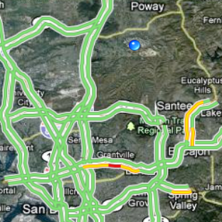
A larger hybrid view of the region showing live reports of highway traffic. I have to stay away from eastbound Interstate 8, where the yellow and red are showing. Notice all the small roads are missing.
A map view zoomed way way out showing the Pacific Ocean, Arizona, Nevada, Utah and Mexico. Only a few major cities and highways are shown. You can also see state and national parks, and state and national borders.
Here are the directions for walking from our office to the airport (not a good idea).
Driving takes 6 3/4 hours less time.
Turn-by-turn driving instructions accompanied with maps. The blue spot moves as you drive along.
Where's the math in this? Everywhere!
Tuesday, September 15, 2009
The Map is not the Territory
A cartographer is a person who draws maps of the land, while a hydrographer creates nautical charts of the sea. What do you call a person who makes charts for pilots? An aeronographer. And finally, a person who makes space charts is an astronographer.
A map shows the terrain and where it goes up (mountains) and down (valleys). A nautical chart shows the same "up" features, only we call them rocks and shoals and islands. Plus we want to see currents, and tides and winds. And lighthouses. Aero- and Astro- maps each have unique features and show things of concern to navigators.
All these maps share some common characteristics:
Here's 1883 Bloomington, IN at that scale. (Click the map to enlarge it.) Notice the Jail!
With a scale of 1 inch = 50 feet, or 1:600, a 20" x 20" map shows an area 1000 feet square.
If the scale is 1 inch = 1 mile, or 1:63,360 scale, a 20" x 20" map can show an area 20 miles square.
If the scale is 1 inch = 5 miles, the scale is 1:316,800 and a 20" x 20" map represents 100 miles on a side.
The US Geological Survey (USGS) publishes many maps. Local governments produce others. Here's a map of Salem, MA from 1893, thanks to the University of New Hampshire Library.
Most topographical maps are 1:24,000 scale, except for Alaska which was mapped at 1:63,360.
Maps at 1:24,000 scale can provide detailed information about local features, including many buildings, campgrounds, creeks, bridges, fence lines, and private roads.
Small-scale maps (1:250,000 and smaller) show very large areas on single map sheets, but details are limited to major features, such as state lines, parks, airports, highways and railroads.
What is the area that can be shown on a 20" x 20" map at 1:250,000 scale?
Let's see: 63,360 goes into 250,000 about 4 times. 63,360 inches = 1 mile, so the 1;250,000 scale is about 1 inch = 4 miles. So 20 inches x 4 = 80 miles each side. 80 x 80 = 6400 square miles!
Here's a aircraft pilot's chart at that scale for Bournemouth in England.
A map shows the terrain and where it goes up (mountains) and down (valleys). A nautical chart shows the same "up" features, only we call them rocks and shoals and islands. Plus we want to see currents, and tides and winds. And lighthouses. Aero- and Astro- maps each have unique features and show things of concern to navigators.
All these maps share some common characteristics:
- A map is NOT the territory it portrays, but is a likeness or representation of the reality
- Maps are NOT pictures of the territory either
- Maps are drawn to scale, otherwise they would be too large to handle
- Not all objects on a map are drawn to scale; some are shown with symbols (blue line = river)
Here's 1883 Bloomington, IN at that scale. (Click the map to enlarge it.) Notice the Jail!
With a scale of 1 inch = 50 feet, or 1:600, a 20" x 20" map shows an area 1000 feet square.
If the scale is 1 inch = 1 mile, or 1:63,360 scale, a 20" x 20" map can show an area 20 miles square.
If the scale is 1 inch = 5 miles, the scale is 1:316,800 and a 20" x 20" map represents 100 miles on a side.
The US Geological Survey (USGS) publishes many maps. Local governments produce others. Here's a map of Salem, MA from 1893, thanks to the University of New Hampshire Library.
Most topographical maps are 1:24,000 scale, except for Alaska which was mapped at 1:63,360.
Maps at 1:24,000 scale can provide detailed information about local features, including many buildings, campgrounds, creeks, bridges, fence lines, and private roads.
Small-scale maps (1:250,000 and smaller) show very large areas on single map sheets, but details are limited to major features, such as state lines, parks, airports, highways and railroads.
What is the area that can be shown on a 20" x 20" map at 1:250,000 scale?
Let's see: 63,360 goes into 250,000 about 4 times. 63,360 inches = 1 mile, so the 1;250,000 scale is about 1 inch = 4 miles. So 20 inches x 4 = 80 miles each side. 80 x 80 = 6400 square miles!
Here's a aircraft pilot's chart at that scale for Bournemouth in England.
Monday, September 14, 2009
Count me in
Arithmomania is a mental condition marked by a compulsive need to count actions or objects around you - perhaps steps, or the letters in a word, or the holes in a ceiling tile, or even angels dancing on the point of a needle.
You may count aloud, or mumble the number to yourself as you walk, brush your teeth or exercise.
Count von Count on Sesame Street has this problem! Do you?
Synesthesia is another math-related condition where people tend to see (sense) a connection between two different items - such as numbers, letters and colors.
In the picture you can see the 2 and N are the same color. A person with synesthesia might tell you a word is misspelled or a sum is incorrect because they would "see" in their heads or in the air that the color patterns are wrong.
This is not considered a disability. It's a special sense, like the musical gift of absolute or perfect pitch.
The rest of us count on our fingers, or do the work in our heads, or rely on any number of manufactured devices. Here is a list of a few that I found:
- calculator
- abacus
- slide rule
- computer
- finger counting
- counting board
- counting table
- adding machine
- finger register
- rent table
- Incan quipu
- tally cords
- split tally stick
- salamis tablet
- Napier's bones
- Pascal's calculator
- Comptometer
- coin counter
- count chanting
- voting machines
Jim at our church uses
one of these devices to
count the people attending
each worship service.
Click, click, click.
Subscribe to:
Posts (Atom)